Design Process
How I got from broken to brilliant
Five phases. Every decision traceable to evidence. Every outcome attributable to a specific change — the kind of structured documentation German product teams expect.
Discover · Weeks 1–2
Understanding where and why the experience was failing
The brief was "improve the app." I reframed it: why are users not completing their first purchase? Before touching a single screen, I spent two weeks in research — not because I had to, but because assumptions about consumer apps are almost always wrong.
- 12 user interviews — split between active users and lapsed users who had uninstalled. The contrast between the two groups was more valuable than either group alone.
- 200+ Hotjar session recordings reviewed for rage taps, dead-end scrolls, and repeated back-button presses — friction users had stopped noticing.
- Competitive analysis of 6 deal apps — Groupon, Too Good To Go, Vouchercodes, and 3 regional competitors. Mapped onboarding flows, discovery IA, and notification strategies.
- 45-participant contextual survey — validated interview themes at scale before making any architectural decisions.

Research synthesis — affinity mapping of 12 interviews, identifying core friction themes across onboarding, discovery, and redemption
Define · Week 3
Turning research into a prioritised problem map
Research produced a long list of problems. Not all were equal. I ran a prioritisation session with the PM — mapping each problem against user frequency, drop-off impact, and development feasibility to agree on what we were actually solving.
- 38% signup abandonment — front-loaded registration asked for too much before giving any value
- Deal irrelevance — no location-aware sorting; users saw deals from shops 40 minutes away
- Redemption confusion — "Claim" CTA left users unsure whether they had purchased or just bookmarked
- Notification spam — all deals pushed to all users; open rate had fallen to 4%
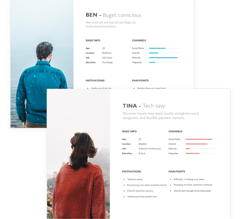
Two personas synthesised from research: Ben (community-oriented parent, values proximity and trust) and Tina (time-poor professional, values speed and relevance)
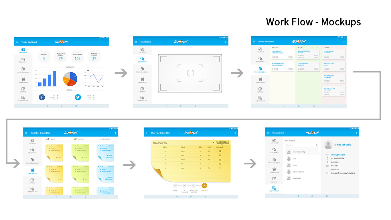
Design · Weeks 4–7
Four decisions that changed how the product worked
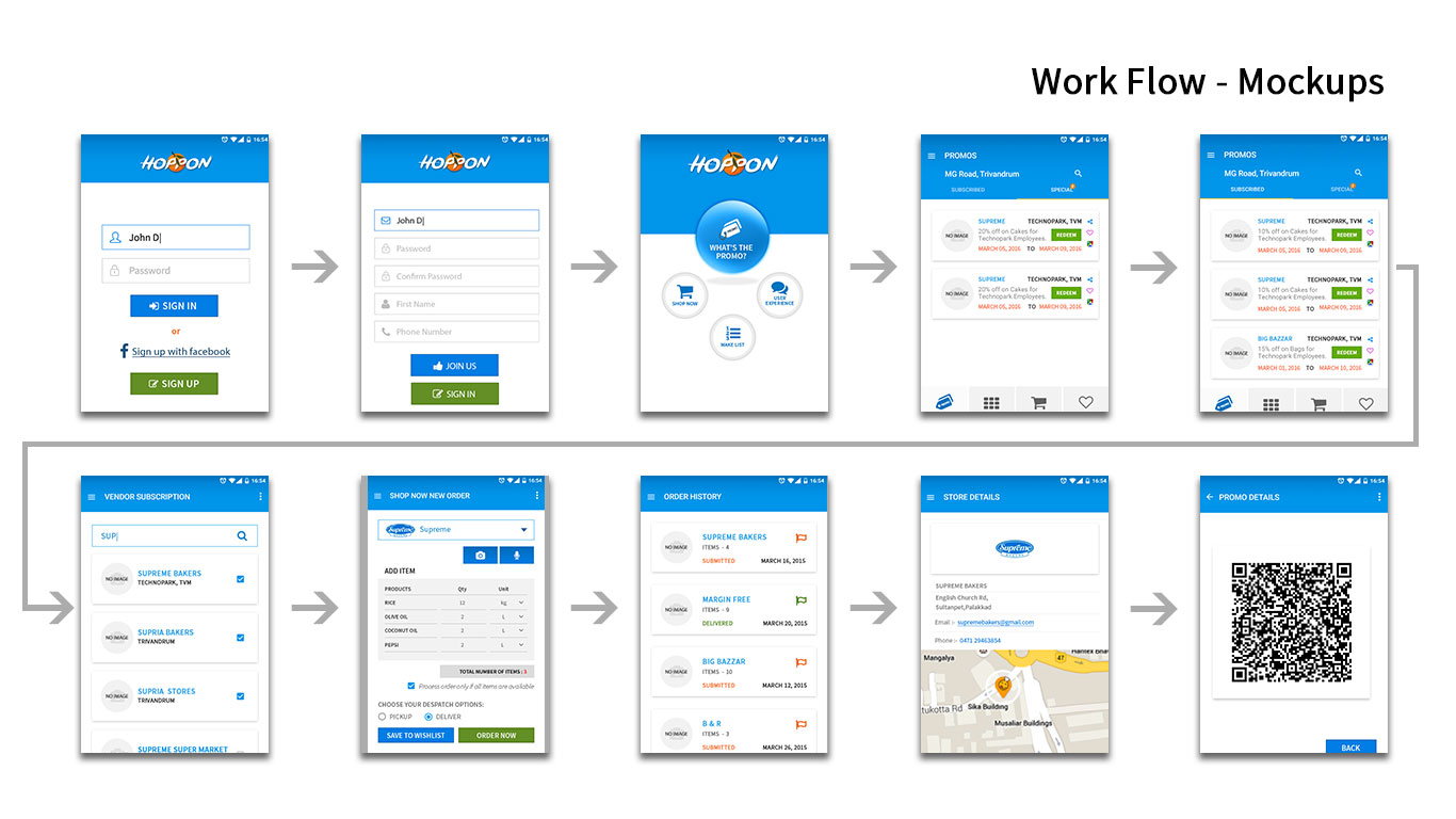
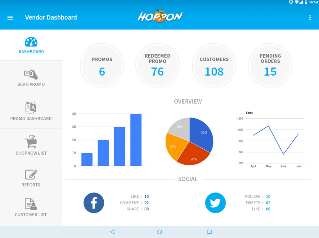
I built the Figma component system before designing any screens — iOS and Android variants, spacing tokens, interaction states, and the platform-specific navigation patterns for both phone and tablet. Every screen came after the system.

Double-diamond process used across the project — diverge on research, converge on problem, diverge on solutions, converge on design
Decision 1 — Progressive onboarding
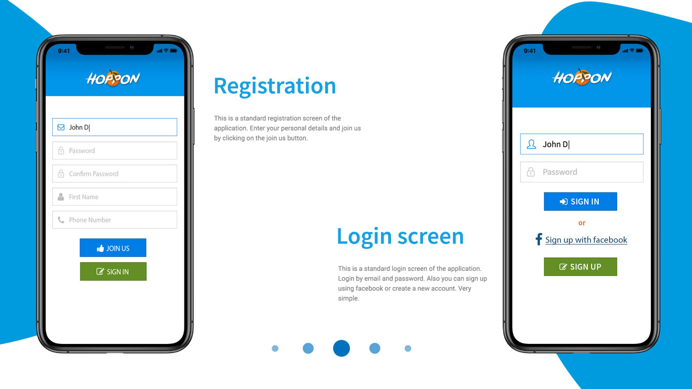
Replaced the 6-field signup wall with a browse-first flow. Users saw deals immediately. Account creation was deferred to purchase intent — just email and password, with social sign-in as the primary option. Preferences collected progressively over 3 sessions.
−52% onboarding abandonmentDecision 2 — Location-first discovery
Rebuilt the home feed around a proximity-aware algorithm. The location permission prompt was rewritten from "Allow Location Access" to "Find deals near you" with a visual radius illustration — opt-in rate jumped from 61% to 89%. Navigation restructured into four clear intents: Nearby · Categories · Trending · Saved.
+67% deal relevance satisfaction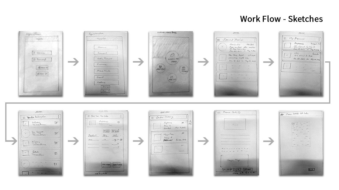
Redesigned home feed (location-aware), deal detail view, and category navigation
Decision 3 — Redemption clarity
Renamed the ambiguous "Claim" CTA to "Get this deal →" with a tooltip explaining what happens next. Designed a four-state redemption progression: Browse → Claim → Confirmed → Redeem. At the in-store step: a full-screen "Show Staff" mode with large voucher code, shop map, and expiry timer.
−41% time to first purchase · Support tickets re: redemption down 70%+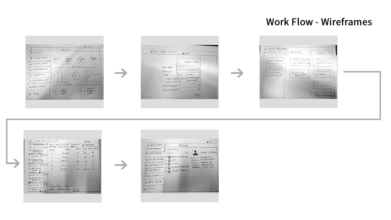
Left: 4-state redemption flow with "Show Staff" mode · Right: smart notification settings with preference controls
Decision 4 — Relevance-first notifications
Worked with the backend team to define a relevance filter — location, browsing history, category preference. Users could set "notification hours" — windows when they were open to deal discovery. Notification card redesigned to show shop name, distance, deal headline, and expiry in a single glance.
Opt-out rate 62% → 24% · Open rate tripledDecision 5 — Tablet-native layout
Tablet users were 18% of the base but had the lowest engagement — the stretched phone UI was a silent churn driver. Designed a two-column master-detail layout: left panel for deal catalogue with filtering, right panel for full deal detail. Purpose-built, not adapted.
Tablet two-column layout — purpose-built, not stretched from phone
+84% tablet session engagementPivots & Constraints · Weeks 5–6
Three directions that were tested, failed, and replaced
Not every design decision shipped. Three approaches were tried, found to be wrong during prototyping and testing, and replaced with better ones. These pivots are the reason the final product worked.
- 3-field onboarding (first attempt) — My first iteration reduced the original 6-field signup wall to 3 fields. Usability testing showed meaningful improvement, but the abandonment rate was still unacceptable. The insight was that the problem wasn't the number of fields — it was asking for any commitment before the user had seen value. Only removing the registration wall entirely and deferring account creation to purchase intent eliminated the barrier. Fewer fields wasn't the solution. No fields until value was delivered was.
- Category-only personalisation — The initial feed algorithm personalised by category preference alone. Post-prototype testing revealed this didn't solve the core problem: users who liked restaurants were still seeing irrelevant deals 40 minutes away. The fundamental issue was proximity, not category. Pivoting to location-first discovery required PM alignment on what "relevant" actually meant as a product goal — it wasn't just a UI change.
- ML-ranked notification relevance (descoped) — The backend team had a prototype machine-learning notification ranker. After scoping the full implementation — 6+ weeks of engineering work — the PM and I agreed to descope it and ship a deterministic rule-based filter instead: location radius + category preference + user-defined notification hours. The rule-based approach produced opt-out rates dropping from 62% to 24% and open rates tripling. The ML version was deprioritised indefinitely.
Every interaction had to feel native on both platforms. Each primary flow was tested on physical iOS and Android devices before sign-off — no lowest-common-denominator compromises.
The existing infrastructure had hard rate limits per user per day. The notification redesign had to work within those limits — which shaped the "notification hours" preference feature as the primary user-controlled solution.
The redesign had to ship before a planned merchant acquisition campaign. The Figma component system was built first specifically to protect this timeline — screen design ran faster because the system existed.
Test · Weeks 6 & 8
Two rounds of moderated usability testing before launch
I ran 6 participants per round, drawn from both persona profiles, across the full journey: app open → find relevant deal → complete redemption. Round 1 findings changed the design before round 2. Round 2 validated it.
- Location prompt wording caused hesitation — felt surveillance-like. Fixed: rewrote copy, added radius illustration. Opt-in rate: 61% → 89%.
- "Claim" CTA confused 3/6 users — unsure if reserved or purchased. Fixed: renamed to "Get this deal →" with inline explanation. Confusion eliminated in round 2.
- Distance not visible in search results — 1 user redeemed a deal 40 mins away. Fixed: distance chip added to every search result card, sorted by proximity by default.
- "Show Staff" screen — all 6 users succeeded immediately. No changes required. Rated highest-satisfaction screen in the test.

Moderated usability testing with participants drawn from both Ben and Tina persona profiles
Outcomes · 60 days post-launch
Every decision measured. Every number attributable.
Tracked via in-app analytics, Hotjar funnel analysis, and a post-launch survey (n=120 active users). Results measured at 60 days.
- −52% onboarding abandonment — progressive sign-up + social login as primary CTA eliminated the registration wall that was losing 38% of new users.
- +67% deal relevance satisfaction — "I find deals relevant to me" moved from 31% agree → 82% agree in post-launch survey.
- −41% time to first purchase — combination of location-aware feed + clearer CTA naming + simplified redemption flow.
- 3.8× daily active return rate — smart notifications + relevance-first feed gave users a reason to open Hoppon even when not actively buying.
- +84% tablet session engagement — purpose-built two-column layout turned lowest-performing segment into one of the highest.
Final Hoppon experience across phone and tablet — stakeholder sign-off presentation