Design Process
How I designed global trust in three weeks
Four clear phases. Every decision documented. A platform that had to work for C-suite buyers, government regulators, and supply chain partners — at the same time.
Discover · Days 1–4
Understanding three audiences with zero margin for confusion
Puregood Global wasn't a consumer product. The website had to convince three distinct audience types simultaneously — international trade buyers, government and Halal certification bodies, and logistics partners. Getting the hierarchy wrong meant losing credibility before a single conversation started.
I began by mapping each audience's primary question on landing, their trust signals, and their decision-making context — before touching a single layout.
- Stakeholder brief deconstruction — identified the three audience types, their goals, and the business KPIs the site needed to support: trade partner acquisition, regulatory credibility, investor confidence
- Competitor audit across 8 international Halal and food safety platforms — mapped visual language, trust signals (certification badges, standards logos, partner grids), content hierarchy, and navigation patterns
- Brand asset review — analysed existing Puregood materials to understand what the visual system needed to honour and what it needed to elevate
- Content inventory against site architecture — mapped all available copy and imagery to a page structure before wireframing, ensuring no section was designed without confirmed content
Define · Days 4–6
Four design principles agreed before a pixel was placed
With three audience types and global reach, visual ambiguity wasn't an option. I defined four design principles with stakeholders upfront — giving every subsequent decision a clear standard to be measured against.
- Trust before information — credibility signals (Halal certifications, standards badges, partner logos) surface before body copy. Buyers decide whether to read based on whether they trust the source first.
- Clarity over cleverness — no jargon in navigation, no ambiguous CTAs. Every label tested against: "Would a non-native English speaker in Kuala Lumpur or Dubai understand this immediately?"
- Global without generic — the visual system needed to feel international and authoritative without the sterile "corporate template" look that signals no design investment.
- Mobile-first, always — senior buyers at trade bodies and regulatory authorities often review platforms on mobile during travel. Desktop polish could not come at mobile's expense.
Design & Build · Days 6–18
Four deliverables, built in parallel, that turned the brief into a live platform
I ran design and front-end build in parallel using a component-first, section-by-section approval process: design a section → get approval → build it → move to the next. This eliminated revision loops and kept the three-week timeline intact across 12 page templates.
Deliverable 1 — UI Design System
Built a complete visual component library before designing any pages: colour tokens (deep green for trust and sustainability, warm neutrals for approachability), a typography scale using a serif-sans pairing for cross-platform readability, button states, form patterns, card components, and a certification badge system. 40+ components documented for WordPress developer handoff and future CMS updates by non-designers.
Consistent visual language across all 12 page templates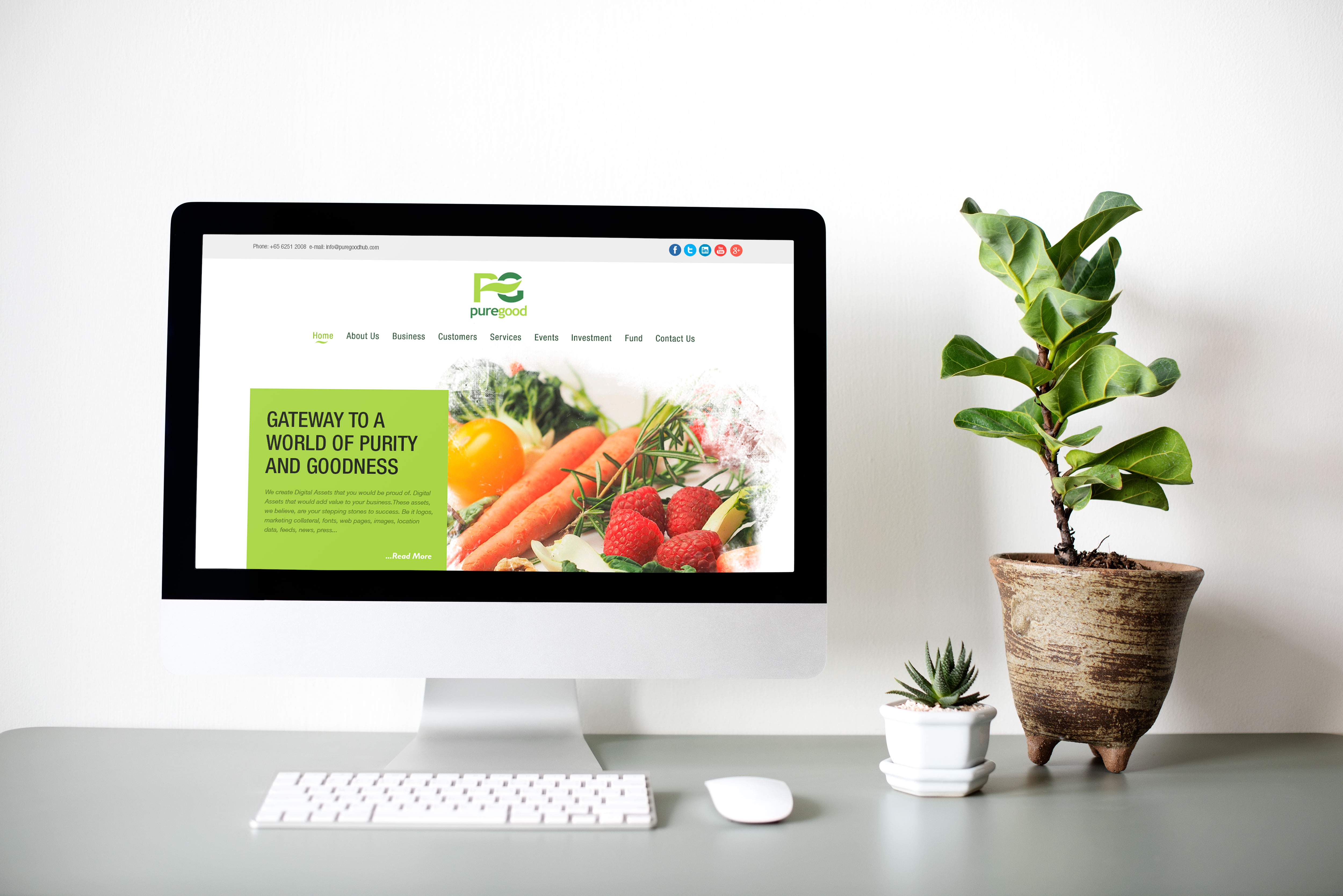
Puregood Global homepage — trust-first hierarchy: certification strip, global reach indicators, and clear service navigation above the fold
Deliverable 2 — Trust Architecture
Designed a dedicated trust layer running through every page: a Halal certification and food safety accreditation strip immediately below the hero, a partner and client logo section with a structured grid layout, a "How it works" process section making the complex supply chain logic visually simple, and a standards compliance section addressing regulatory audience needs directly. These weren't decorative — they were the commercial argument made visual.
All three audience trust questions answered above the fold on every pageDeliverable 3 — Responsive HTML5/CSS3 Build
Converted all design mockups to semantic, well-structured HTML5 and CSS3 using a mobile-first breakpoint strategy: 375px mobile layout first, then tablet (768px), then desktop (1200px+). Custom CSS for all hero and trust sections — no generic Bootstrap columns — ensuring pixel-perfect fidelity to the approved design at every breakpoint. Tested across 12 device and browser combinations before delivery.
100% device coverage · zero layout failures post-launch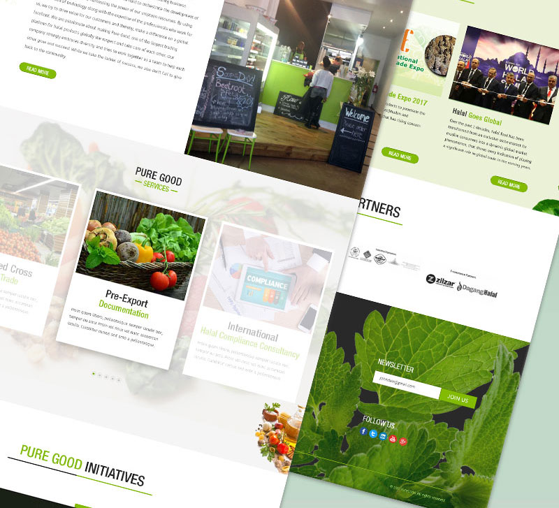
Inner service pages — structured content hierarchy, certification integration, and responsive layout tested across phone, tablet, and desktop
Deliverable 4 — jQuery Interaction Layer
Implemented lightweight jQuery for: smooth scroll navigation, an animated statistics counter section (partner countries, certified products, trade volumes), a mobile-optimised accordion FAQ, and a contact form with inline validation eliminating submission errors. All interactions had defined CSS fallback states for no-JavaScript environments — critical for government and regulatory network contexts where scripts are often blocked.
Zero JavaScript errors across all tested environmentsPivots & Constraints · Days 10–15
What was tested, changed, and constrained during the build
A three-week timeline with a global B2B client, multi-timezone stakeholders, and phased content delivery required fast, principled decision-making when things didn't work as planned. Three design directions were changed and several constraints shaped final decisions.
- All-serif typography system (first iteration) — The initial visual system used a serif typeface throughout — body copy, headings, and UI labels. The brief positioned Puregood as a premium, authoritative brand, and serif type felt aligned with that positioning. Stakeholder review flagged it correctly: the all-serif approach felt dated and heavy for a global B2B platform serving buyers in regulated industries. I pivoted to a serif-sans pairing: Instrument Serif for display headlines (authority, premium feel) and DM Sans for body copy and UI labels (clarity, international readability). The pairing achieved both goals without the legibility cost of a mono-serif system.
- Certification section below the fold (first layout) — The first homepage layout positioned the Halal certification and food safety accreditation badges in the "Our Credentials" section midway down the page — logical from an information architecture perspective. Competitor analysis showed that every high-converting equivalent platform surfaced certifications immediately below the hero. For regulatory and trade audiences, credibility signals aren't secondary information — they're the reason to read further. I moved the certification strip to position 2 on the page, directly below the hero, before any service description.
- Animated statistics section (scoped back) — The original brief requested a JavaScript-animated statistics counter on the homepage. During implementation, it was discovered that several regulatory authority offices used managed browser environments with JavaScript blocked by policy — a confirmed constraint from the client. Rather than risk a broken experience for a critical audience, I implemented the statistics section as a static, visually strong CSS layout with jQuery animation as a progressive enhancement — falling back gracefully to the static version in no-JS environments.
Client stakeholders were across Singapore, UAE, and the UK. All approvals happened asynchronously via annotated section mockups shared via email — the component-gate workflow was specifically designed to work without live review sessions.
Final copy for 4 of the 12 pages arrived during the build phase. The component-first system meant those pages could be built to the template structure immediately and content-swapped when it arrived — no re-layout required.
The platform had to be live before a Singapore trade conference. The parallel design-build workflow with section-by-section approval gates was the only way to deliver 12 page templates in three weeks without revision loops.
Arabic and Hebrew market audiences were in scope for version 2. The CSS was written with RTL compatibility in mind from day one — using logical properties where possible — so the RTL implementation wouldn't require a full code rework.
Outcome · Week 3
On time. Enterprise-grade. Zero post-launch revisions.
The platform launched on schedule at the end of week three. The client confirmed zero post-launch revision requests — a direct result of the component-first approval process and the parallel design-build workflow that caught issues at the component level before they reached live code.
- 40+ reusable UI components documented for independent WordPress content management
- 12 fully responsive page templates — homepage, about, services, trade partners, certification, contact, and 6 service sub-pages
- Production HTML5/CSS3 codebase — semantic markup, optimised assets, cross-browser tested
- jQuery interaction layer with graceful CSS fallbacks for all dynamic elements
- WordPress theme integration — all components mapped to custom fields for non-technical content updates
- Zero post-launch revision requests — delivered first time, on time