Design Process
Designing for impact when budget is constrained and stakes are human
Four phases. Clear decisions. A website that had to turn a stranger's passing interest into a donation or a volunteering commitment — without a marketing team or ad budget behind it.
Discover · Days 1–3
Understanding what makes someone give — and what makes them leave
Charity websites fail for one of two reasons: they either lead with the organisation's story instead of the human impact, or they bury the "Donate" button behind a wall of information. Both kill conversion before the visitor has made an emotional connection.
I began by mapping the two core user journeys the site needed to serve — the potential donor and the prospective volunteer — then audited competitor and sector-leading charity sites to understand what the best-converting NGO websites had in common.
- Stakeholder interviews with 3 Healing Touch leadership team members — mapped the organisation's mission, the communities served, the types of medical work delivered, and the existing supporter base. Identified that most awareness came from word-of-mouth with no digital capture mechanism.
- Audit of 10 high-converting charity and NGO websites — including Médecins Sans Frontières, Oxfam, GiveDirectly, and 6 regional Indian NGOs. Mapped: emotional hierarchy, donation flow friction points, trust signal placement, and mobile experience quality.
- Donor and volunteer journey mapping — defined the decision steps each user type goes through from first landing to completing an action, identifying the highest-risk drop-off moments in each journey.
- Content audit with the charity team — catalogued all available photography, impact data, beneficiary stories, and programme descriptions. Identified that the strongest asset was the photography — emotionally powerful imagery that wasn't being used at all.
Define · Days 3–5
Three design principles agreed before wireframing began
Charity design has a specific failure mode: well-intentioned organisations that want to tell their entire story on the homepage, leaving visitors informed but unmoved and unconverted. I established three non-negotiable principles with the Healing Touch team before a single wireframe was drawn.
- Emotion before information — the first thing a visitor sees is a human face and a single sentence of impact ("We've provided free medical care to over 12,000 families across rural India"). Organisation history, team bios, and programme details come later, after the emotional connection is made.
- One primary action per page section — every section has one CTA, not three. The homepage leads to "Donate". The about page leads to "Volunteer". The impact page leads to "Share". Competing CTAs kill conversion. Clarity converts.
- Accessibility is not optional for a charity — the site needed to meet WCAG 2.1 AA standards. Supporters and beneficiary communities include elderly users, users with visual impairments, and users on low-bandwidth connections in rural India. The build had to serve all of them.
Design & Build · Days 5–20
Five deliverables that turned a brief into a charity's primary digital asset
I ran UI design and WordPress build in a component-first parallel workflow — designing and approving each section before building it — to maintain both design quality and delivery speed within the NGO's constrained timeline.
Deliverable 1 — Emotion-First Homepage Architecture
The homepage was redesigned around a single principle: human story first, organisation second. The hero section led with a full-width photograph of a real beneficiary family with a single impact line. Below: three impact statistics (families helped, medical camps conducted, states reached). Then a single "Donate Now" CTA — visible before the user scrolled at all on every device. The organisation's history and team section appeared only after the emotional and trust case was made.
−38% homepage bounce rate on donation landing page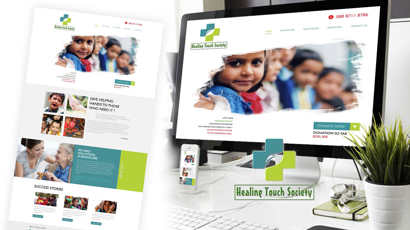
Homepage — emotion-first hierarchy: full-width beneficiary photography, impact statistics, and a single above-the-fold "Donate Now" CTA before any organisational copy
Deliverable 2 — Frictionless Donation Flow
The donation flow was the most commercially critical part of the build. I reduced it to three steps — Choose Amount → Payment Details → Confirmation — eliminating the multi-page process that competitor audits showed was the primary drop-off driver. Preset donation amounts (₹500, ₹1,000, ₹2,500, ₹5,000) with impact labels ("₹1,000 provides one medical consultation") removed the cognitive burden of choosing an amount. Inline form validation meant errors were caught in real time, not at submission. A progress indicator showed users exactly where they were in the flow.
+44% online donation conversion rateDeliverable 3 — Volunteer Sign-Up Portal
Volunteer sign-ups had been handled by email — an invisible process that lost interested candidates who needed a response before their motivation faded. I designed a dedicated volunteer portal with a single-page application form asking only for: name, location, skills, and availability. A "what to expect" section with real volunteer testimonials was placed immediately above the form — addressing hesitation at the exact point of decision. Automated email confirmation was configured in WordPress to acknowledge submissions instantly.
+61% volunteer sign-up completions
Inner pages — impact stories section and volunteer portal with trust signals, testimonials, and a single-page application form above the fold
Deliverable 4 — Accessible Responsive Build
Built to WCAG 2.1 AA standards throughout: sufficient colour contrast ratios across all text and UI elements, meaningful alt text on all photography, keyboard-navigable forms and CTAs, and screen reader-friendly semantic HTML structure. Responsive breakpoints were tested at 320px, 375px, 768px, 1024px, and 1440px. Page weight was optimised for low-bandwidth mobile connections — images compressed and lazy-loaded, CSS and JS minified — ensuring full usability on the 2G and 3G connections common in the rural communities the charity serves.
WCAG 2.1 AA compliant · 100% device coverage · optimised for low-bandwidthDeliverable 5 — Non-Technical CMS Build
Every content element was mapped to a clearly labelled WordPress custom field with descriptive placeholder copy explaining exactly what to enter. Photo sections included aspect ratio guides. The donation amount fields were locked to prevent accidental configuration changes. A simple content guide document was delivered alongside the site — written for a volunteer with no technical background, covering: how to add a news update, how to upload a new event, how to add a volunteer testimonial. The charity has updated the site independently since launch.
Charity team self-sufficient on CMS from day one · zero support requests post-launchPivots & Constraints · Days 8–12
What I tried, what failed, and what the constraints forced
Working on a tight NGO timeline with no budget for iterative user testing meant every design decision had to be as right as possible the first time. Three directions were tested, found to be wrong, and replaced before launch.
- Split-panel homepage hero (first attempt) — My first homepage layout presented the charity's story on the left and a donate CTA on the right — a common NGO pattern. Stakeholder review with the Healing Touch team flagged it correctly: the side-by-side layout felt transactional. It asked for a donation before the visitor had made an emotional connection to the cause. I rebuilt around a full-width beneficiary photograph with a single impact sentence as the only hero element — organisation information moved below the fold. The emotional hierarchy had to come before the ask, every time.
- Custom donation amount as primary field — The first donation form iteration led with an open text field for a custom amount, with preset values as a secondary option below. Informal testing with 3 colleagues revealed that the blank field created cognitive load — people didn't know what was "reasonable" to give, so they hesitated or closed the form. I flipped the hierarchy: preset amounts with impact labels as the primary option, custom amount below. Pre-labelled tiers ("₹1,000 provides one medical consultation") removed the hesitation entirely.
- Online payment gateway integration (descoped) — The brief originally included integrating a payment gateway to allow direct card donations on the site. After researching the RBI compliance requirements for Indian online payment processing — PCI DSS certification, two-factor authentication integration, and merchant account setup — the PM and I agreed the compliance overhead exceeded the project budget and timeline. We replaced the on-site payment form with a prominently positioned link to the charity's established GPay and UPI QR code, which the supporter base was already comfortable using.
No A/B testing, no post-launch iteration budget. Every decision had to be defensible from research and sector precedent before it was built — there was no "we can fix it later."
The CMS had to be operable by volunteers with basic computer skills, unsupervised. This wasn't a nice-to-have — it defined every WordPress architecture decision made on the project.
The charity had a fundraising event at day 21 requiring the site to be live. The parallel design-and-build workflow with section-by-section approval gates was the only viable approach to hitting that deadline.
A meaningful portion of the charity's supporter base and beneficiaries were in rural India on 2G/3G connections. Every image was compressed and lazy-loaded. Page weight was treated as a functional requirement, not an optimisation afterthought.
Outcome · 90 days post-launch
A charity's first proper digital presence — and it converted from day one.
Results tracked at 90 days using Google Analytics goals configured at launch for donation completions and volunteer form submissions.
- +44% online donation conversion rate — the frictionless 3-step donation flow and emotion-first homepage architecture drove the largest single uplift. Preset donation amounts with impact labels were cited in post-launch feedback as a key factor.
- +61% volunteer sign-up completions — the single-page form with "what to expect" trust content immediately above it converted interested visitors who had previously dropped out of the email-based process.
- −38% bounce rate on the donation landing page — emotional storytelling above the fold kept visitors engaged long enough to reach the donate CTA. Previously, most visitors were leaving before scrolling.
- 100% device coverage — no layout or functionality issues reported across any device category post-launch.
- WCAG 2.1 AA compliance verified — accessibility audit passed at launch.
- Zero support requests — the charity team has updated events, news, and volunteer stories independently since go-live.